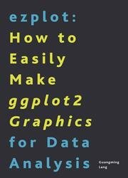
 Название: ezplot: How to Easily Make ggplot2 Graphics for Data Analysis
Автор: Guangming Lang
Издательство: Leanpub
Год: 2021-03-06
Страниц: 138
Язык: английский
Формат: pdf (true), epub
Размер: 21.4 MB
This book will teach you two things: how to make high quality statistical charts, and how to do it fast. The tool we’ll use is a R package called ezplot, which I wrote to help me with my consulting work. After working through this book, you will be able to create any of the top 10 most used charts in less than 1 minute. Hadley’s ggplot2 is a great tool, but one still needs to know the nuts and bolts to customize a ggplot2 chart. In the beginning, I did a lot of code recycling. But every time I copy-and-pasted a chunk of code, I had to change the data frame or variable name to make the code work for the new case. This worked fine for one or two charts, but became very tedious when I had to create many charts. And I often had to make more than 50 charts for a typical client project.
Under the hood, all ezplot functions use ggplot2 functions. My goal was not to invent a new plotting system, but to make it very easy to create high quality ggplot2 charts with a few lines of code, requiring the user zero or minimal effort of customization.
Six years ago, I started a data science consulting company. Almost all my projects require some kind of data visualization. Because I'm a R programmer, ggplot2 became my primary charting tool. The thing about ggplot2 is that making a generic plot is easy, but customizing is hard. There're just too much details to remember. At first, I did a lot of code recycling, but that was still very inefficient as I had to manually change things to make old code work with new data. As the repertoire of reusable codebase grew, it became painful to find the right piece of code for the things I wanted to do. Moreover, code recycling lead to code repetition, which made my R script lengthy and difficult to read. One day, the frustration became unbearable, and I decided to change it all. The result is ezplot, a R package based off ggplot2. It's available on github. Ezplot has saved me tons of hours. A plot that used to takes me 30+ minutes now takes me less than 1 minute. I now use ezplot for all my projects. I truly love it, and I think you’ll love it too.
In this book, I’ll show you how to use ezplot with lots of examples. After working through this book, you will be able to efficiently produce these most used statistical charts:
• dot plot
• histogram & density plot
• CDF plotCCDF plot
• box plot
• Q-Q plot
• vertical and horizontal bar chart
• lollipop chart
• likert plot (a.k.a, horizontal diverging bar chart)
• scatter plot
• line plot (rank-order plots and lift charts as special cases)
• dumbbell plot
• heat map
• forest plot
You will get most out of this book by typing and running the code presented in the book. Do NOT just copy and paste them. Type the code. This will also help you become a better R programmer in general.
Скачать ezplot: How to Easily Make ggplot2 Graphics for Data Analysis