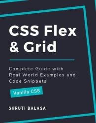
 Название: CSS Flex & Grid: Complete Guide with Real World Examples and Code Snippets (Vanilla CSS)
Автор: Shruti Balasa
Издательство: Independently published
Год: 2022
Страниц: 190
Язык: английский
Формат: pdf (true)
Размер: 27.7 MB
CSS flexbox and grid have become two of the most important topics of web design. Most of the tutorials on the web teach these concepts using some coloured blocks. You get introduced to all the CSS properties related to these concepts and how they work. But very rarely you get to see some examples of where and how these are used in the real world. Without understanding the real world application, learning is incomplete.
This book takes a completely different approach. I won't teach you the things flex and grid can do. Instead, I will first show you some components and layouts and make you think how to build them using the CSS concepts you already know. Now you have a problem, and you want a solution. That's when I introduce the concepts you "need" to know. This is called Problem-Based Learning (PBL) which will not only keep you motivated throughout the book, but also help you retain the knowledge far better.
Why this book?
Most of the tutorials on the web teach the concepts of CSS Flexbox and Grid using some coloured blocks. You get introduced to all the CSS properties related to these concepts and how they work. But very rarely you get to see some examples of where and how these are used in the real world. Without understanding the real world application, learning is incomplete.
This book takes a completely different approach. I won't teach you the things flex and grid can do. Instead, I will first show you some components and layouts and make you think how to build them using the CSS concepts you already know. Now you have a problem, and you want a solution. That's when I introduce the concepts you "need" to know.
This is called Problem-Based Learning which will not only keep you motivated throughout the book, but also help you retain the knowledge far better.
Prerequisites:
Throughout this book I will assume that you know the basics of CSS. You need not be good at it, but just need to know about properties like width, height, margin, padding, font, color, background, border, position, float and concepts of viewport, responsive web design and media queries.
Who is this book for?
Whether you are a beginner at CSS who's never heard of flex and grid, or someone who knows all the concepts but finding it hard to implement in real projects, or anywhere in between, this book is for you. Even if you're here to just look at some examples and practise your skills, you will find a great collection here.
If you are completely new to Flexbox and Grid, don't skip any of the steps above. Go through the examples multiple times if needed, until you understand what's going on. Please note that the order in which the concepts are covered in this book is very different from most of the tutorials you will see. So I recommend completing this book fully before you look into other resources online, to avoid confusion.
If you have a little knowledge of these CSS properties already, you can try out each of the examples and directly compare with the working demo. Even if you got it right, I recommend reading the concept next to reinforce the knowledge you already have.
Скачать CSS Flex & Grid: Complete Guide with Real World Examples and Code Snippets (Vanilla CSS)