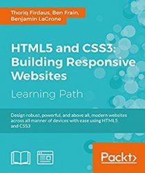
 Название: HTML5 and CSS3: Building Responsive Websites
Автор: Thoriq Firdaus and Ben Frain
Издательство: Packt Publishing
Год: 2016
Формат: PDF, EPUB, MOBI
Размер: 51 Мб
Язык: английский / English
Responsive web design is an explosive area of growth in modern web development due to the huge volume of different device sizes and resolutions that are now commercially available. The Internet is going mobile. Desktop-only websites just aren't good enough anymore. With mobile internet usage still rising and tablets changing internet consumption habits, you need to know how to build websites that will just “work,” regardless of the devices used to access them. This Learning Path course explains all the key approaches necessary to create and maintain a modern responsive design using HTML5 and CSS3.
Our first module is a step-by-step introduction to ease you into the responsive world, where you will learn to build engaging websites. With coverage of Responsive Grid System, Bootstrap, and Foundation, you will discover three of the most robust frameworks in responsive web design. Next, you'll learn to create a cool blog page, a beautiful portfolio site, and a crisp professional business site and make them all totally responsive.
Packed with examples and a thorough explanation of modern techniques and syntax, the second module provides a comprehensive resource for all things “responsive.” You'll explore the most up-to-date techniques and tools needed to build great responsive designs, ensuring that your projects won't just be built “right” for today, but in the future too.
The last and the final module is your guide to obtaining full access to next generation devices and browser technology. Create responsive applications that make snappy connections for mobile browsers and give your website the latest design and development advantages to reach mobile devices. At the end of this course, you will learn to get and use all the tools you need to build and test your responsive web project performance and take your website to the next level.